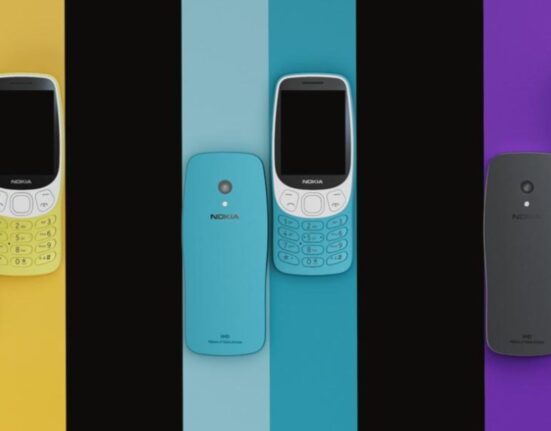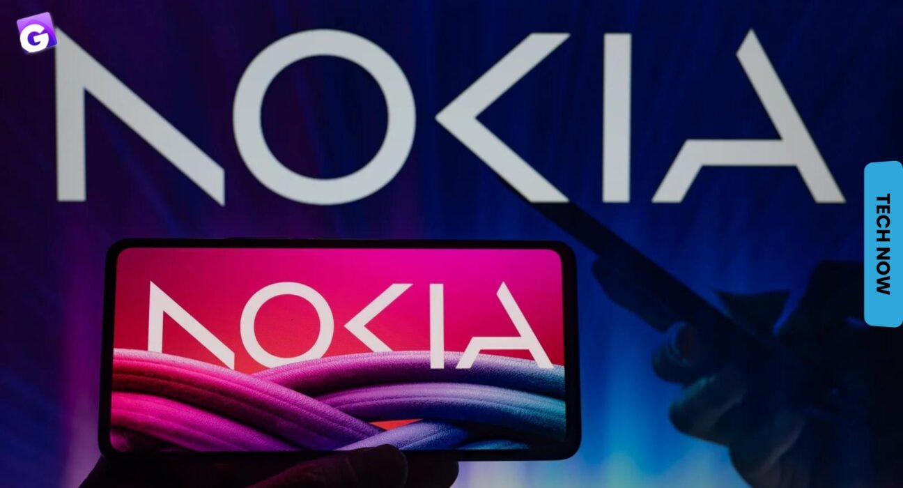
Nokia, the Finnish telecommunications giant, has unveiled a new logo after six decades in a move that marks the start of a new era for the company. The new logo, which completely ditches the company’s distinctive blue color, features a simplified, modernized design with a more rounded typeface and a bolder, more prominent “N” symbol.

Also read: ‘I See You’: New Technology Will Make It Possible To See Through Walls Using WiFi
The change reflects Nokia’s focus on innovation and modernization as it looks to establish itself as a leader in the 5G technology market. The company’s CEO, Pekka Lundmark, stated that the new logo represents “a fresh start for Nokia, as we continue to build a company that will shape the future of technology.”
What do you think of Nokia’s new logo? Let us know in the comments section below!